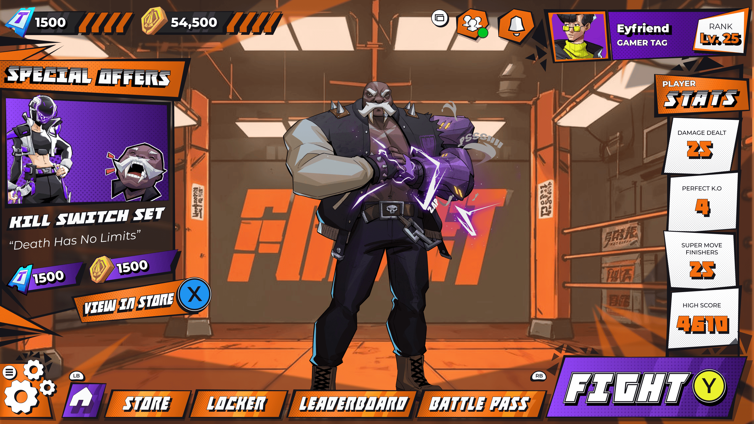
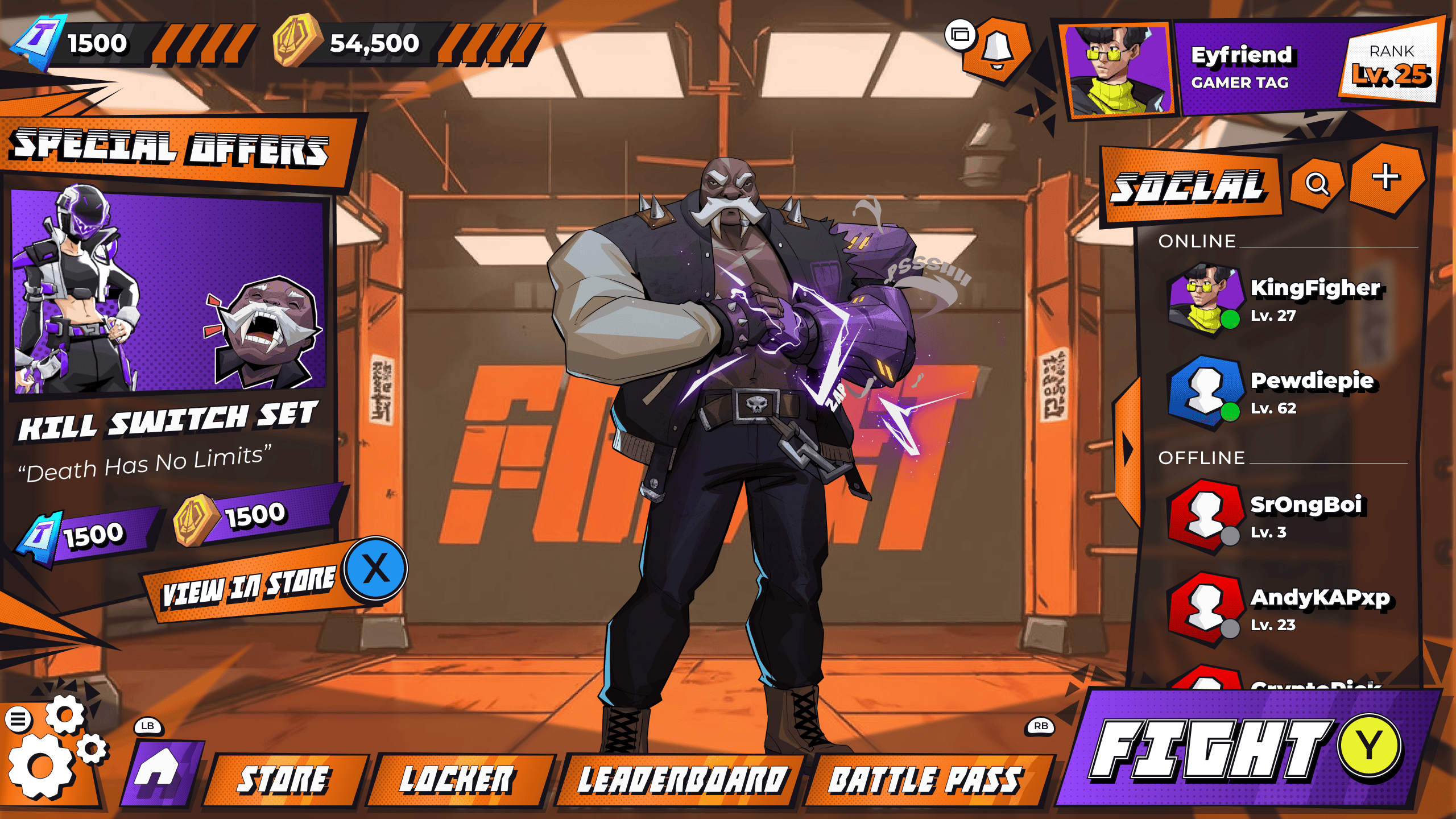
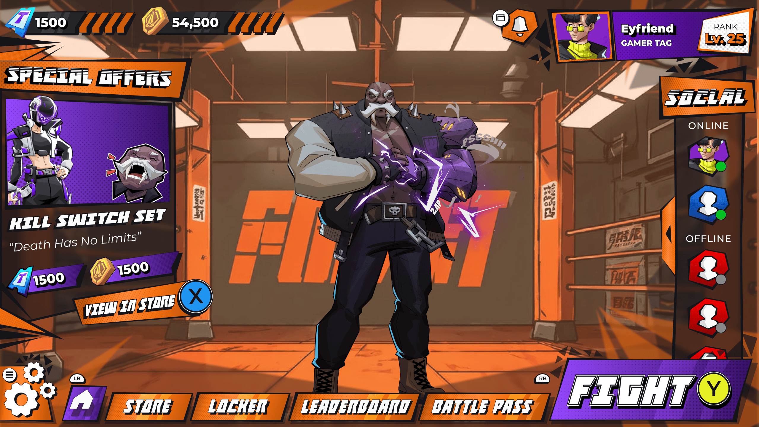
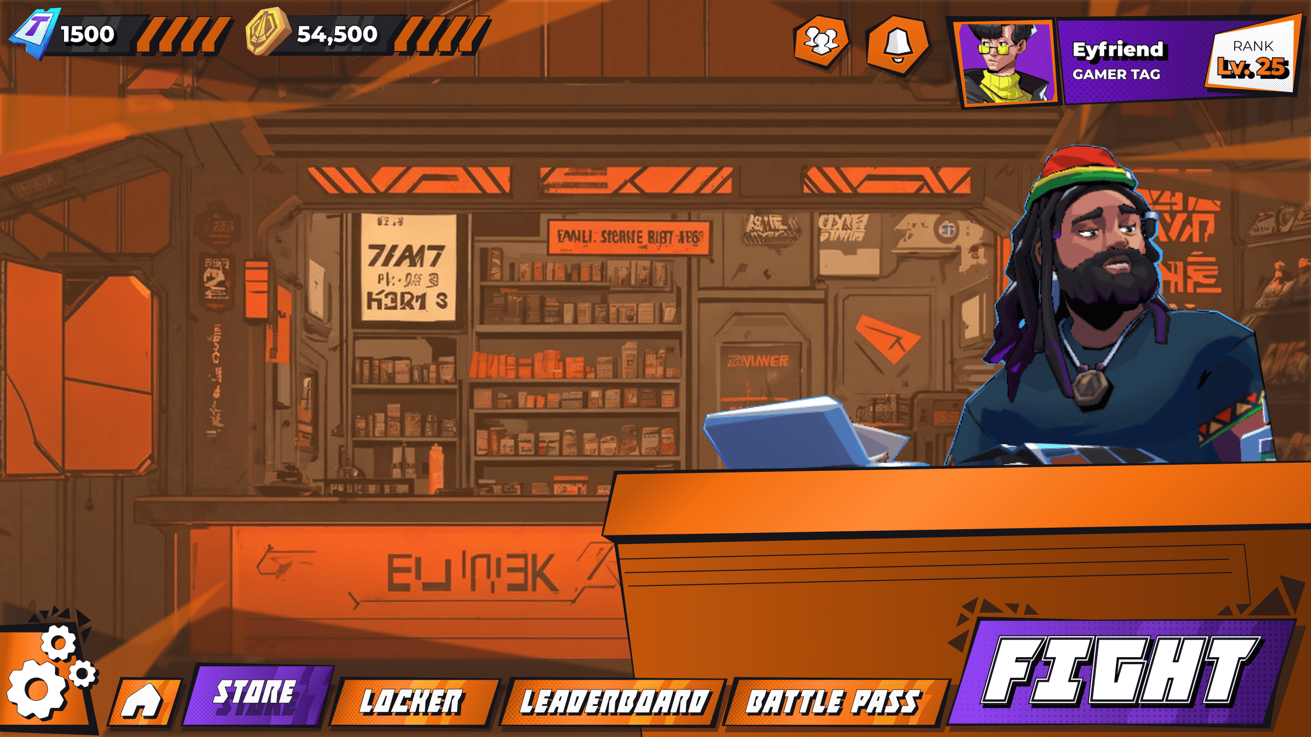
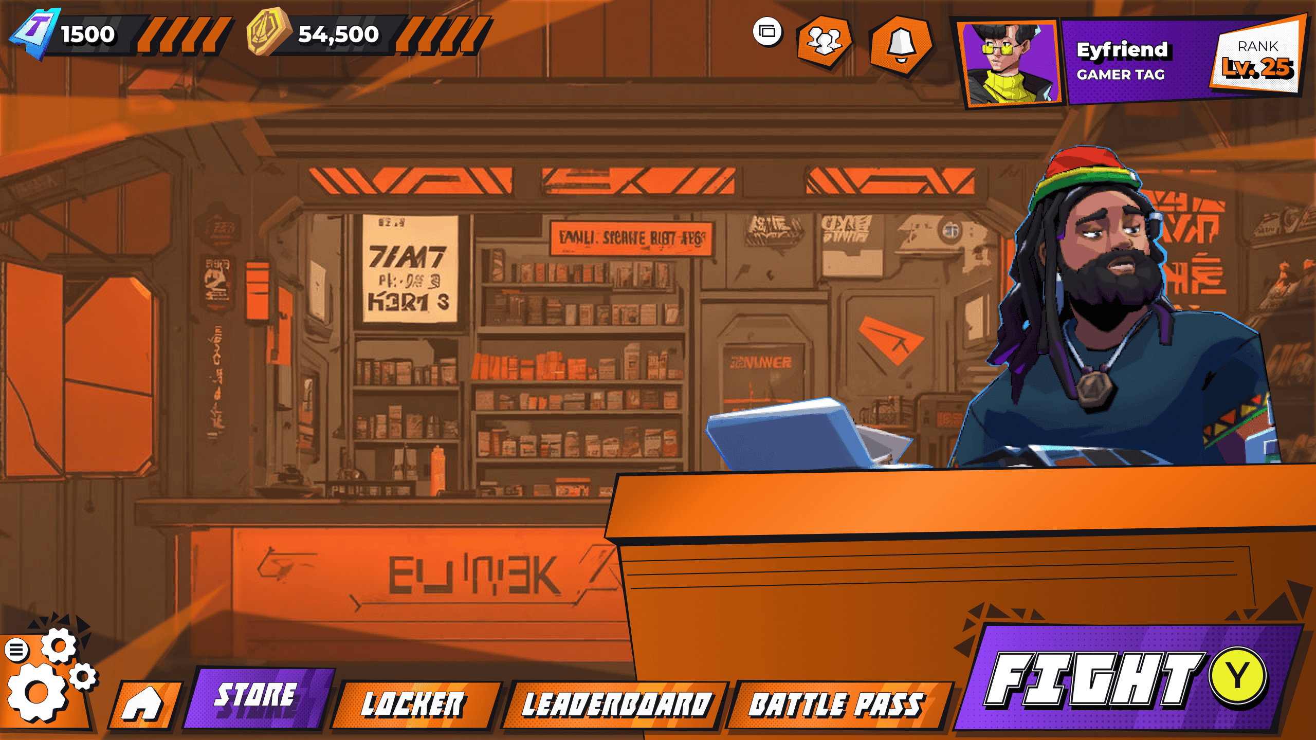
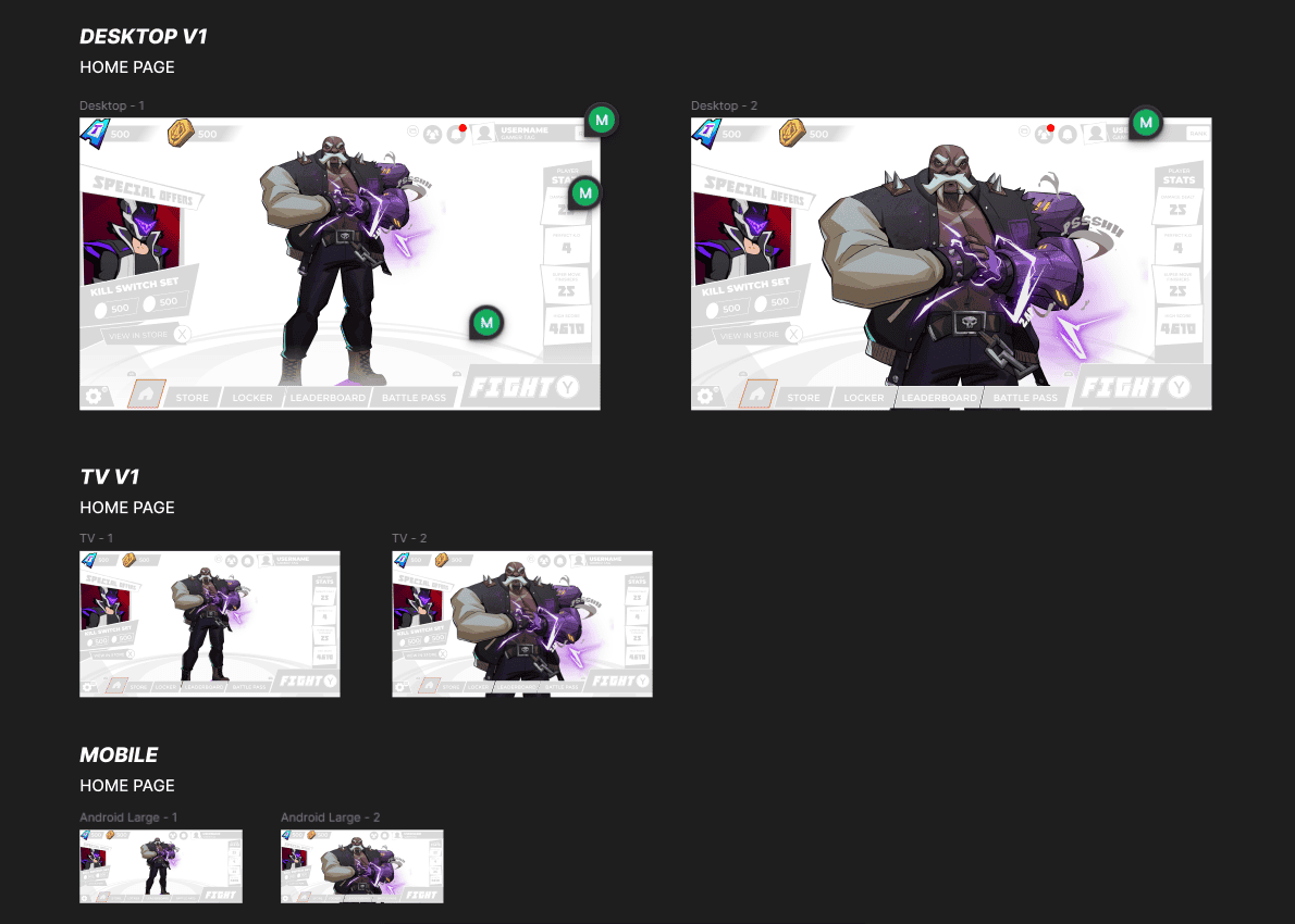
As an independent UI/UX contractor, I was privately contacted to craft the home-screen interface for Super Dragon Punch Force 3—designing custom iconography, logo concepts, and a dynamic leaderboard for player stats, all fully optimized across PC, console, and mobile. I also delivered a comprehensive style guide detailing color palettes, typography, and visual rules, blending proven usability patterns from Fortnite and Minecraft with the franchise’s bold, hand-drawn comic-book aesthetic to create an immersive, on-brand welcome experience.
Project Layout:
Phase 1:
Research and Flow
I play-tested the existing build to fully grasp its user flow and pain points. On Figma’s first page, I mapped out that flow alongside my research notes, laying the groundwork for every subsequent design decision. This immersion was crucial for spotting optimization opportunities and getting a true feel for how players experience the game.
Phase 2:
Wireframe - Low Fidelity (Design & Prototype)
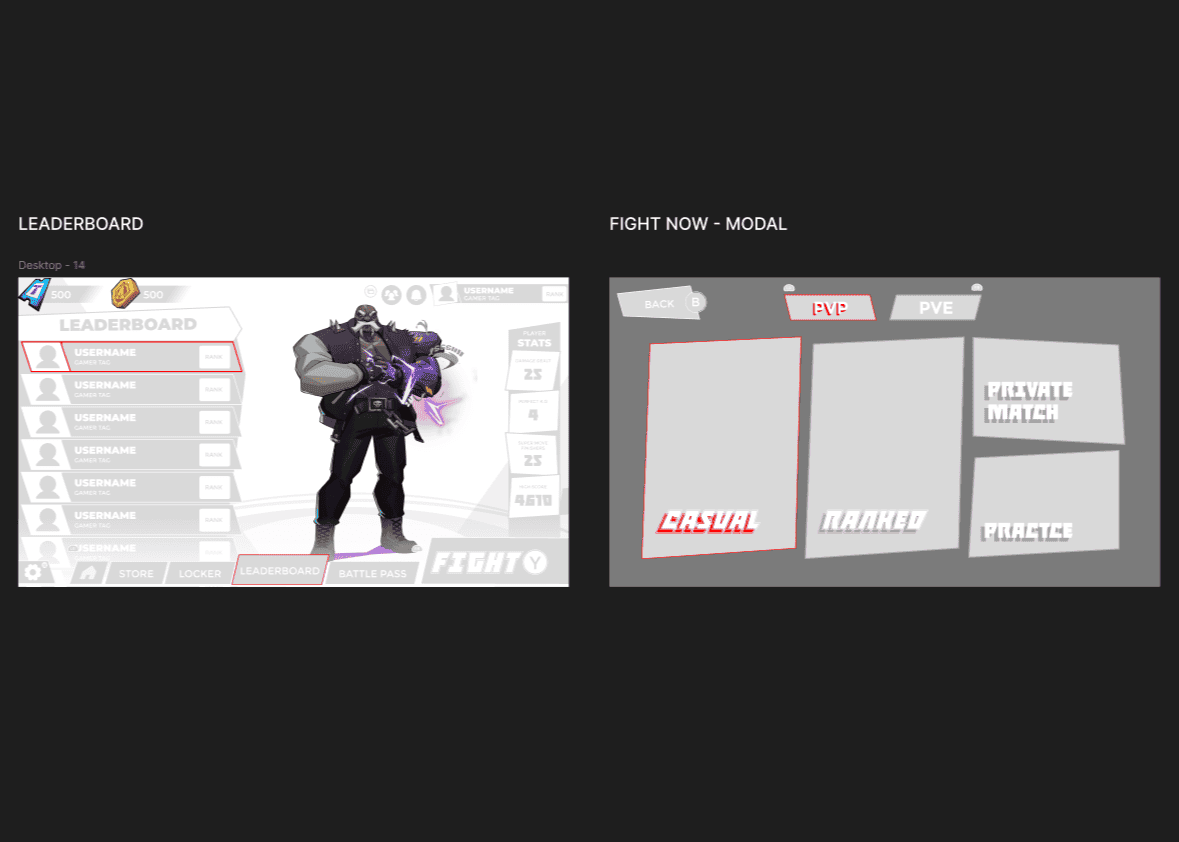
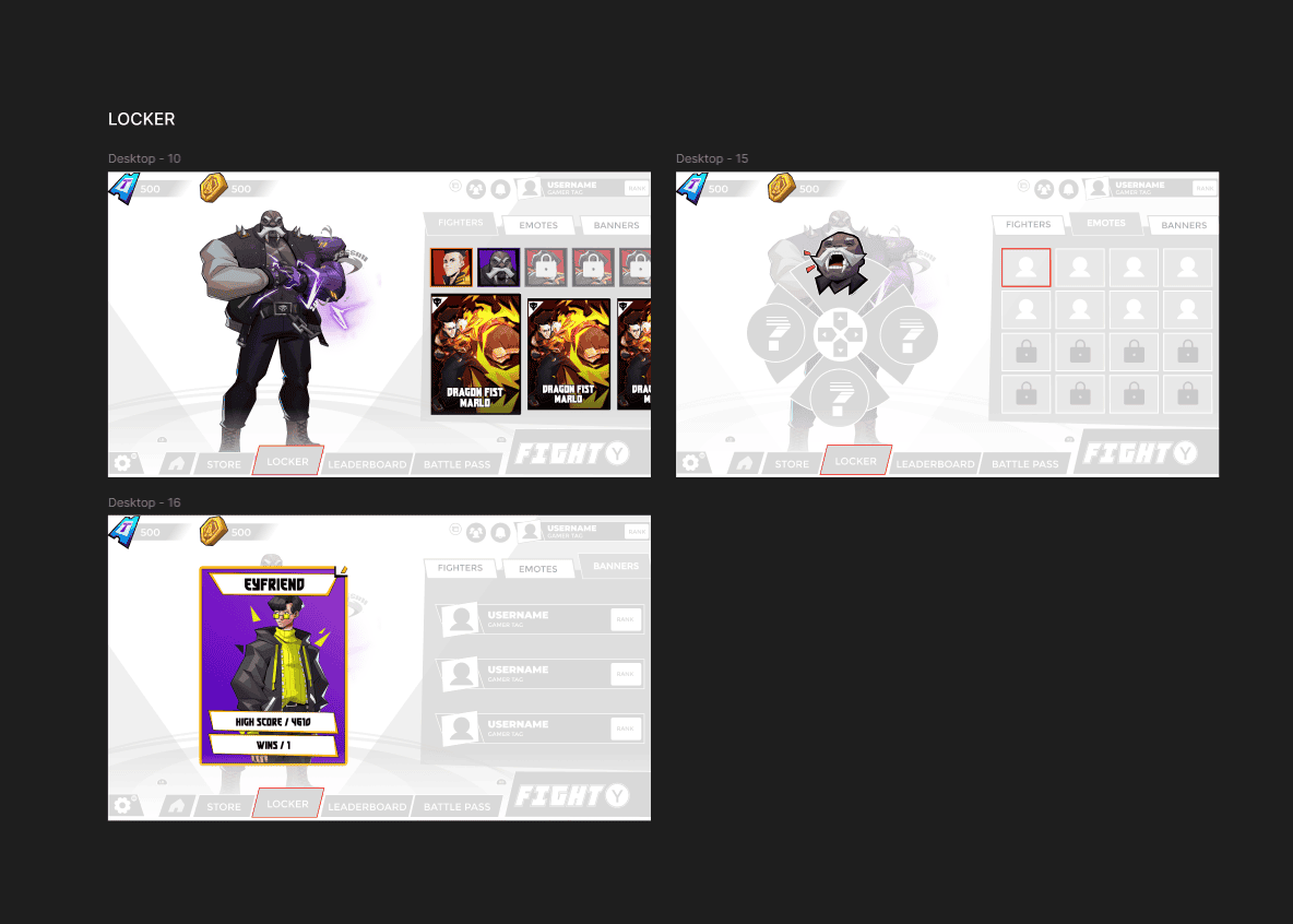
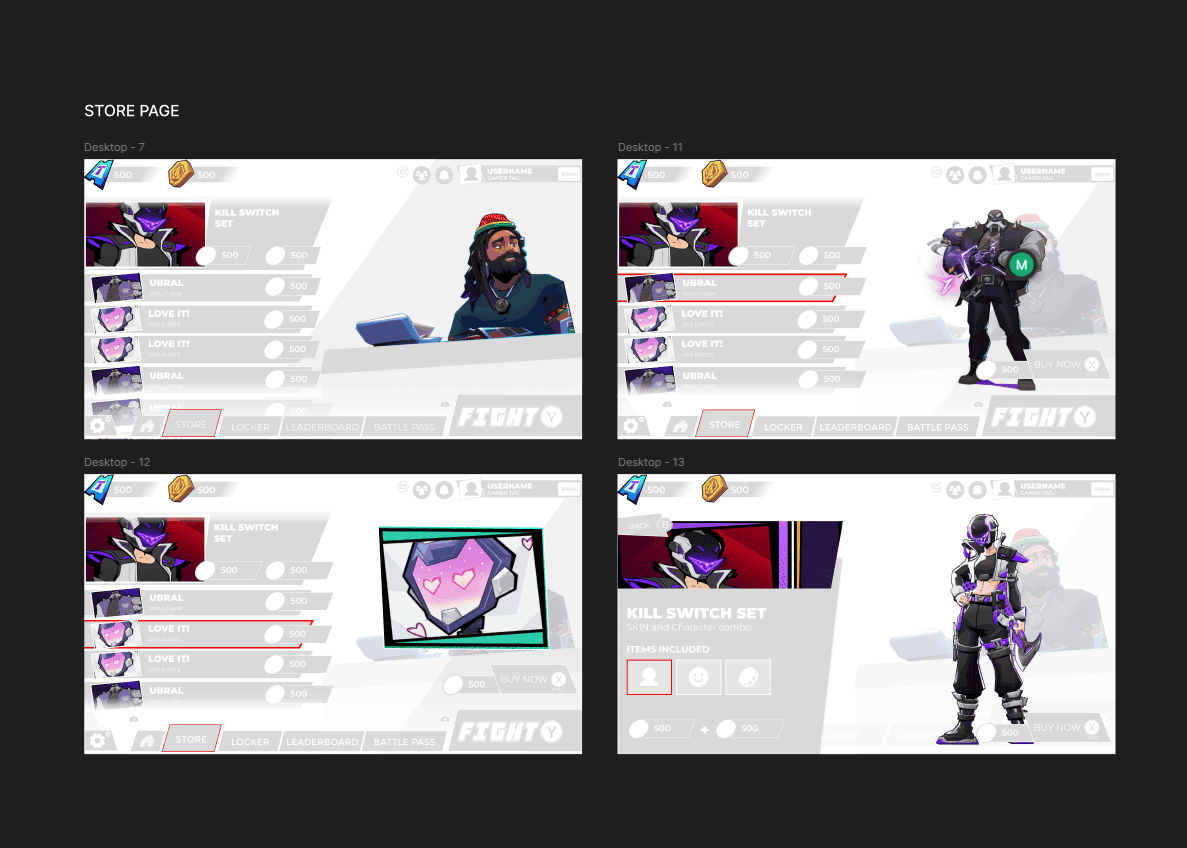
During this phase, I developed low-fidelity wireframes and sketched out core concepts, ensuring each idea would adapt seamlessly to different use cases. I paired grayscale, stylized placeholder blocks with existing art assets to demonstrate how the new layouts function—and to give the client a tangible sense of the new design direction.
Phase 3:
Design System
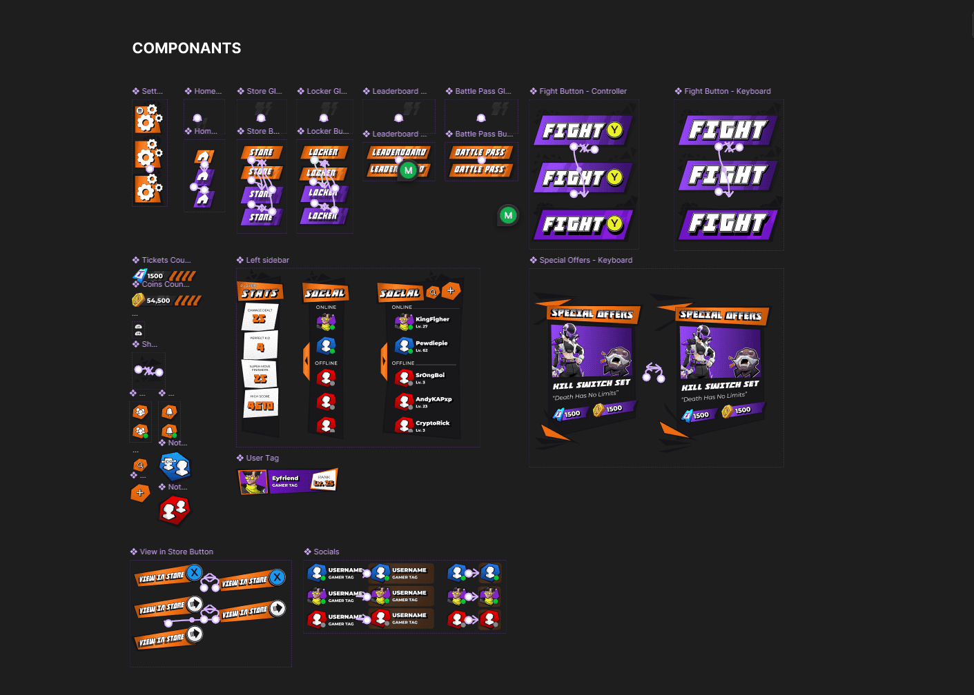
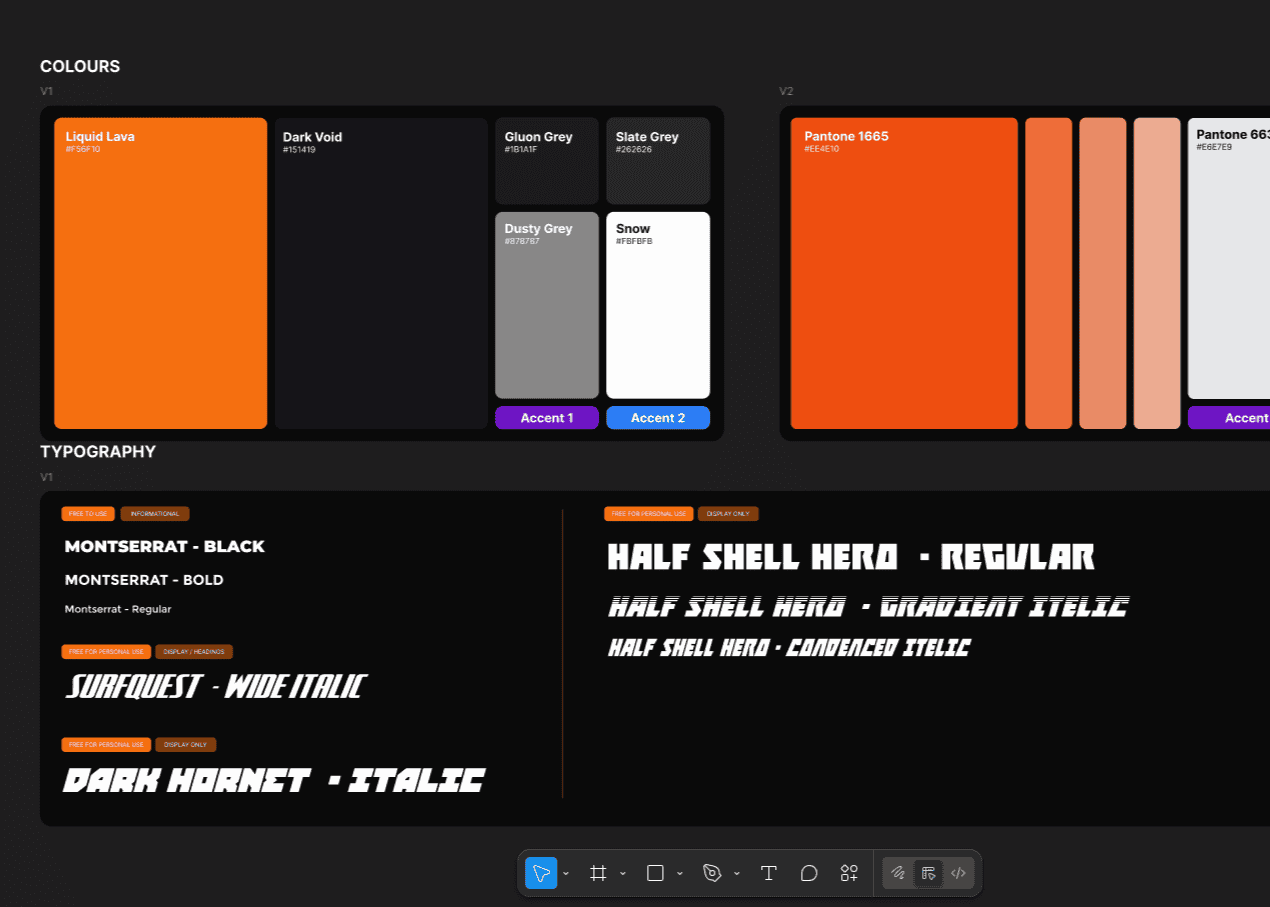
The design system phase was all about refining and systematizing the visual elements. I explored and finalized the primary, secondary, semantic, and natural color palettes, ensuring they aligned with the game's theme and usability standards. I also selected fonts, typefaces, and text styles, setting rules for weights, sizes, and spacing. Each of these elements was added to the Figma library, including reusable components and color variables. This step ensured consistency across the design and streamlined the transition to high-fidelity prototyping and development.
Phase 4:
Final Design - High Fidelity (Design & Prototype)
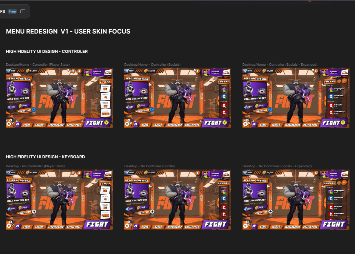
In the final phase, I combined all the elements to create the polished, developer-ready high-fidelity design of the menu (As per the brief). This file included detailed button variants, component states, and other UI elements, all designed for seamless handoff. The interactive prototype showcased a fully functional demonstration of the game main menu, complete with all visuals and mechanics. This allowed stakeholders and developers to experience the design as intended, providing a clear vision for the development phase and ensuring alignment across the team.
Logo Design
Logo Design
SUPER DRAGON PUNCH FORCE 3
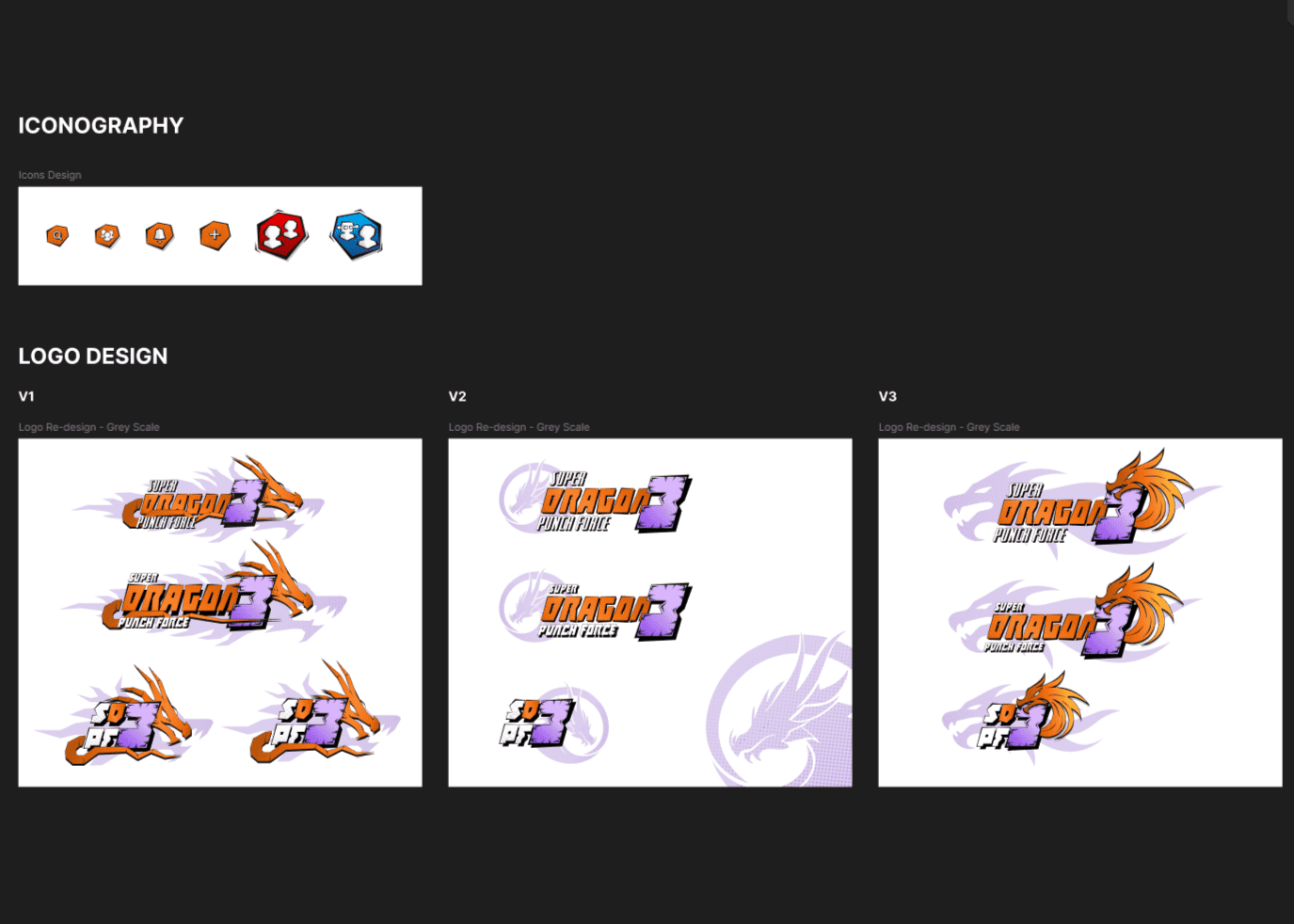
The SDPF3 logo was built in Figma from scratch, combining bold comic-style typography with a dynamic illustrated dragon to capture the game’s over-the-top personality. I designed the lettering with exaggerated angles and thick outlines to match classic arcade fighter aesthetics, then integrated the dragon so it feels like it’s bursting through the title. The colour treatment, halftone shading, and motion streaks reinforce the high-energy feel of the franchise. This direction allowed the logo to work both as a full title lockup and as a simplified emblem for in-game and marketing use.
Menu High fidelity Figma Prototype (Desktop & Console):