We had multiple Lotto-style games, each designed in separate files. While the mechanics and colors differed, the underlying layouts, flows, and UI patterns were largely the same. This led to:
Inconsistent design patterns across games.
Duplicated work for both designers and developers.
Slower time-to-market for new game variants.
To solve this, I proposed creating a centralized design system to unify components, layouts, and styles, while still allowing for game-specific customization.
Project Case Study
1. The Problem:
We had multiple Lotto-style games, each designed in separate files. While the mechanics and colors differed, the underlying layouts, flows, and UI patterns were largely the same. This led to:
Inconsistent design patterns across games.
Duplicated work for both designers and developers.
Slower time-to-market for new game variants.
To solve this, I proposed creating a centralized design system to unify components, layouts, and styles, while still allowing for game-specific customization.
2. The Goal:
Build a scalable design system that manages multiple Lotto games.
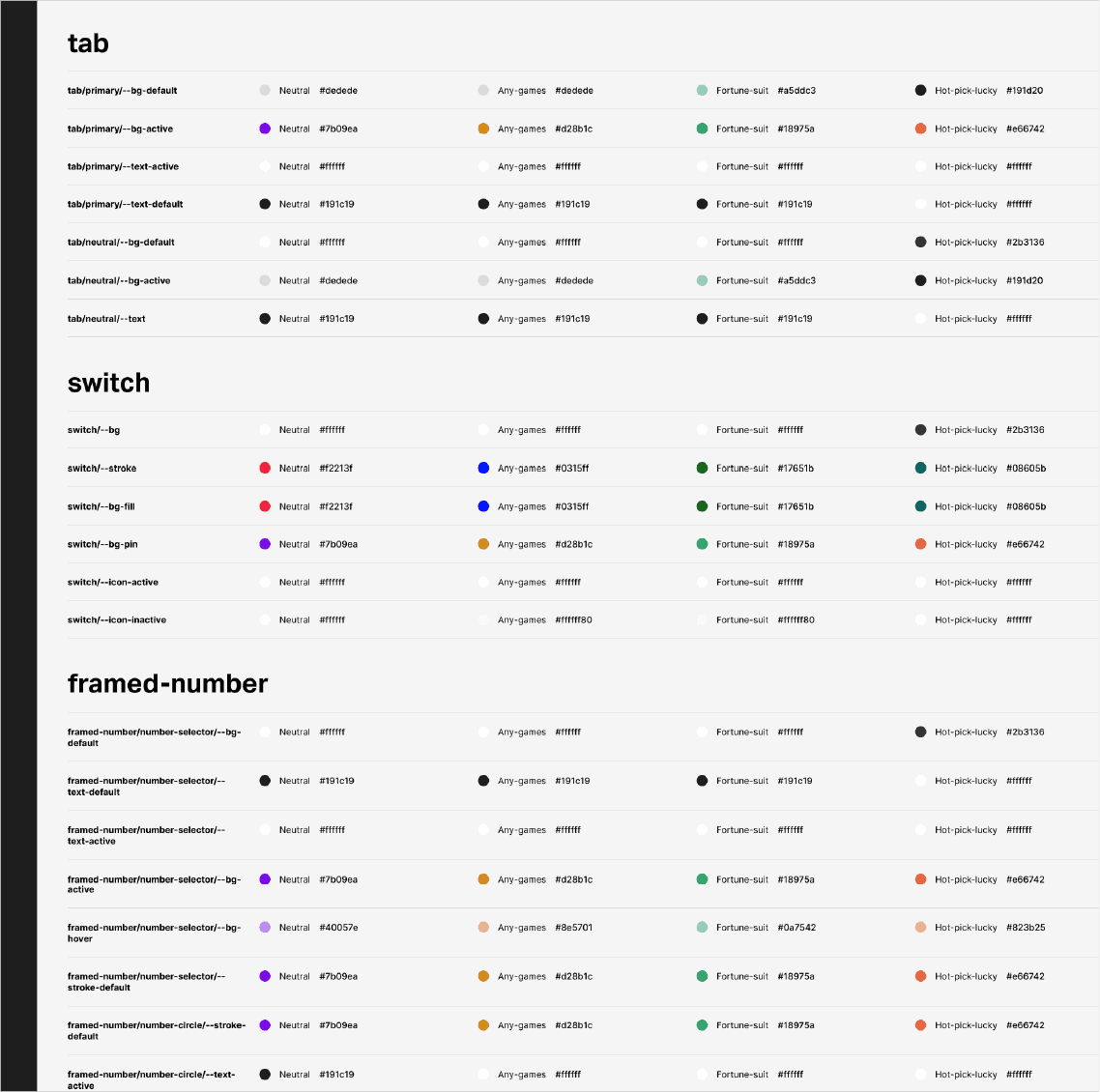
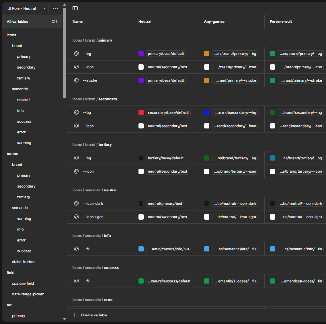
Introduce tokenisation for colors, typography, spacing, and states.
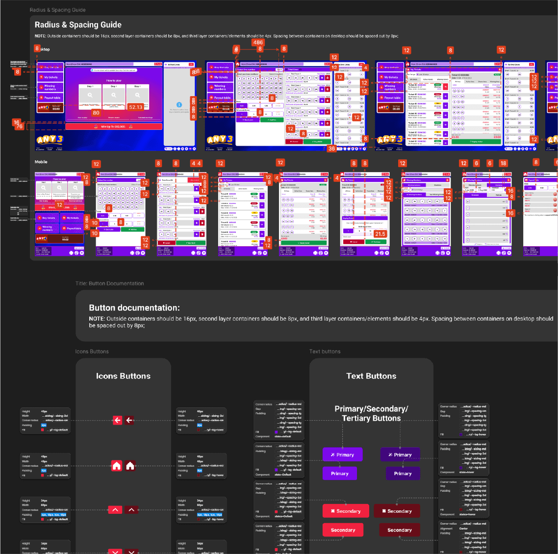
Provide documentation for developers to ensure seamless handoff.
Create a consistent player experience across different game themes.
3. Foundations: Tokens & Variables:
The design system starts with design tokens, ensuring consistency and easy updates:
Color Tokens:
Primary, secondary, tertiary, accent scales.
Semantic colors (success, error, warning, info).
Neutral/greys for UI balance.
Typography Tokens:
Headings, subheadings, body, captions.
Scales for desktop & mobile readability.
Spacing & Sizing:
4pt grid system for rhythm and hierarchy.
Component padding/margins defined as tokens.
4. Components:
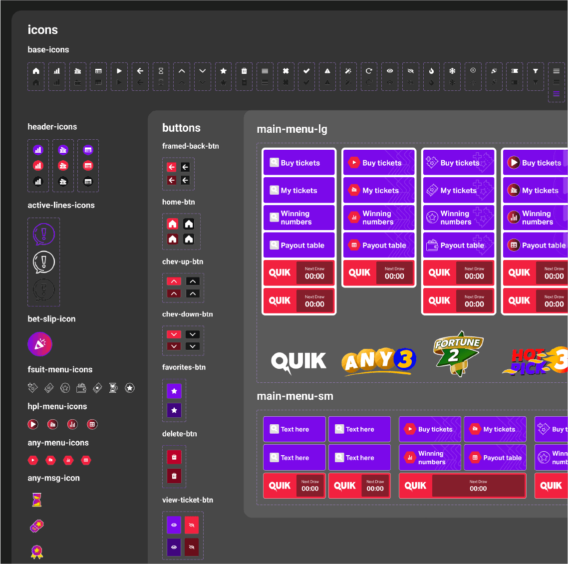
With tokens in place, we built reusable components:
Buttons (primary, secondary, ghost, disabled).
Inputs and form fields.
Number grids and result displays.
Navigation elements.
Modals and pop-ups for game results.
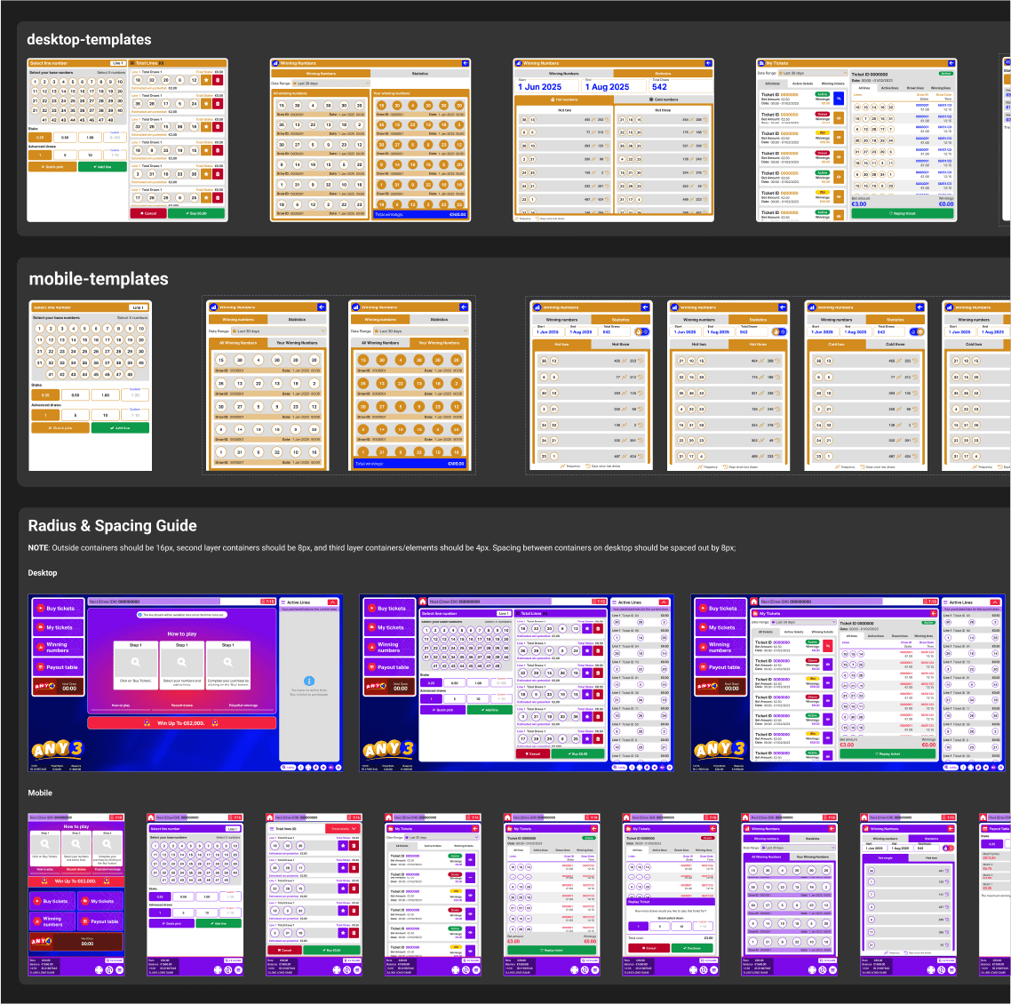
Each component was designed to adapt across themes (e.g., “Gold Lotto” vs “Midnight Lotto”) with minimal effort.
5. Thematic Variations:
While the core UI remains consistent, each Lotto game gets its own theme layer:
Brand colors applied via tokens.
Backgrounds, gradients, and iconography swapped per theme.
Mechanics visualized with the same components but different “skins.”
This made it easy to launch new Lotto games while keeping development lean.
6. Documentation & Handoff:
I created developer-focused documentation:
Usage guidelines for each component.
Token references for implementation in code (e.g., CSS variables or JSON tokens).
Accessibility notes (contrast ratios, text legibility).
This ensured developers could build games quickly without ambiguity.
Hey, a video!
7. Results & Impact:
Reduced design/development time for new Lotto games.
Consistent and professional brand identity across all products.
Improved collaboration between designers and developers.
Created a foundation that scales as new games are introduced.
8. My Role:
Research & Audit: Analyzed existing Lotto games and identified inconsistencies.
System Architecture: Structured tokens, components, and documentation.
Design Execution: Built the UI kit in Figma.
Collaboration: Worked with developers to ensure smooth handoff and scalability.
9. What I Learned:
The importance of building systems, not screens.
How to balance consistency with flexibility for themed products.
The value of documentation in cross-team collaboration.