I partnered with Biptel during a major growth push, leading a full brand overhaul that kept the spirit of their old identity but finally gave it the polish it deserved. I redesigned their logo, rebuilt their website, refreshed all marketing and presentation materials, and basically became their on-call “make-everything-look-better” designer. This project shows how I take a scattered, outdated brand and turn it into a cohesive, modern system that actually works everywhere—from business cards to the browser.
The original Biptel logo had charm, but it struggled with balance, readability, and modern scalability. The icon and type felt disconnected, the proportions were uneven, and the visual style didn’t translate well across digital or print. Still, it had a clear identity foundation — especially the signal motif — which I used as the core inspiration for the redesign.
Their New Logo
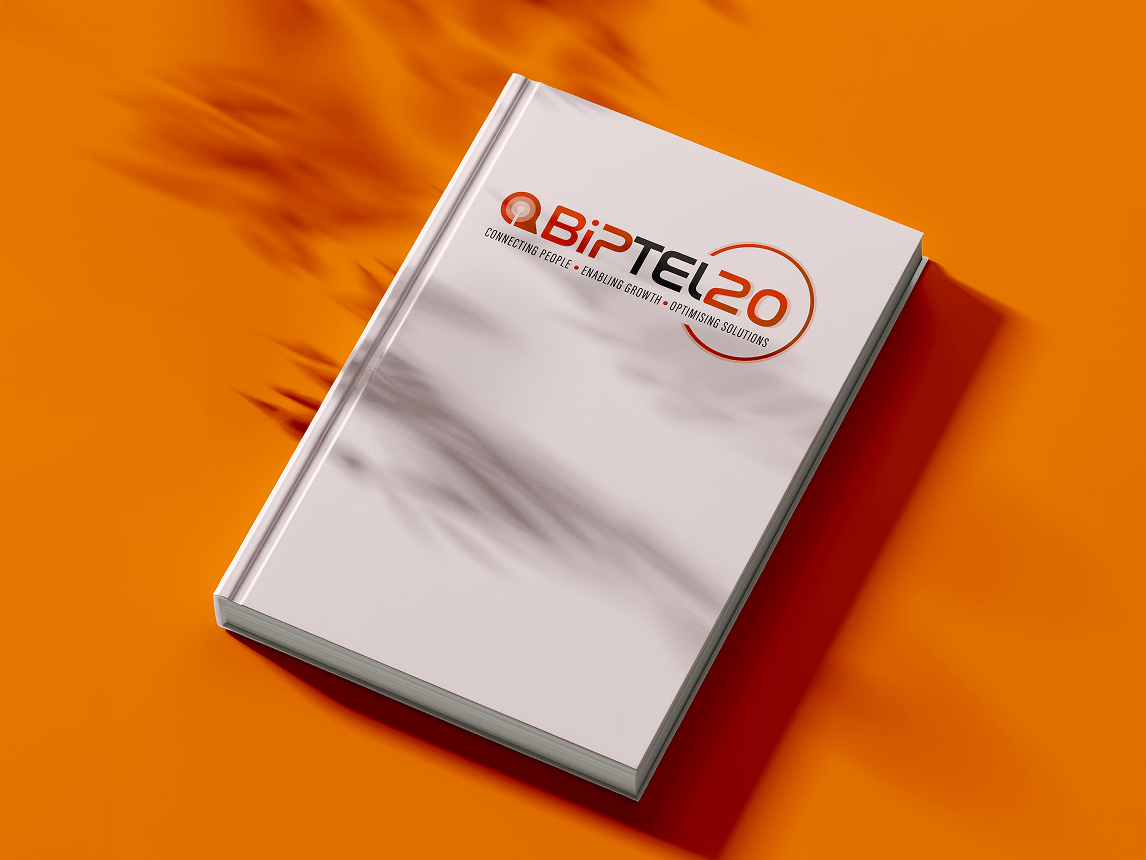
The new logo keeps the essence of the original — the signal icon and warm colour story — but refines everything with cleaner geometry, clearer hierarchy, and better weight distribution. I re-engineered the mark to feel modern, scalable, and professional while still instantly recognizable as “Biptel.” It’s the same brand DNA, just finally levelled up.
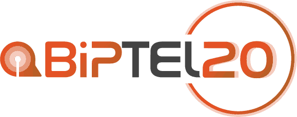
20 Year Anniversary Logo
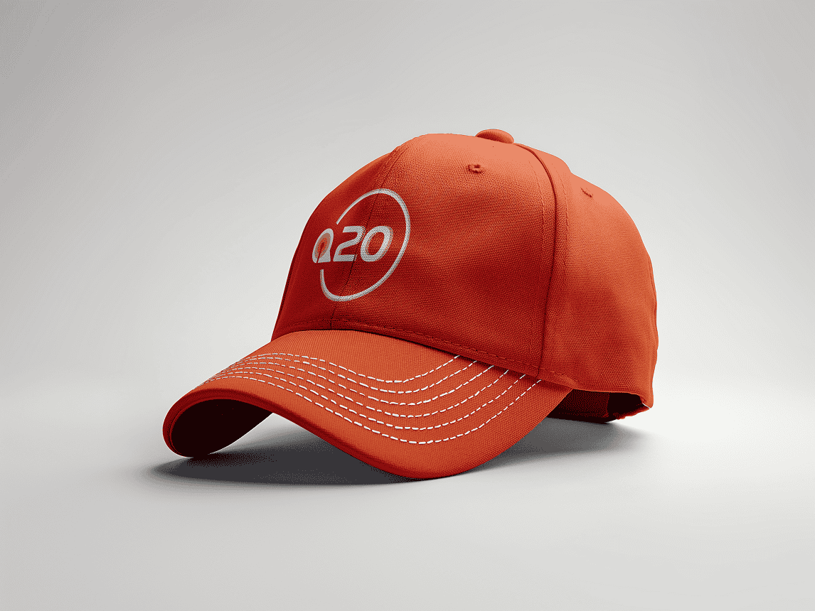
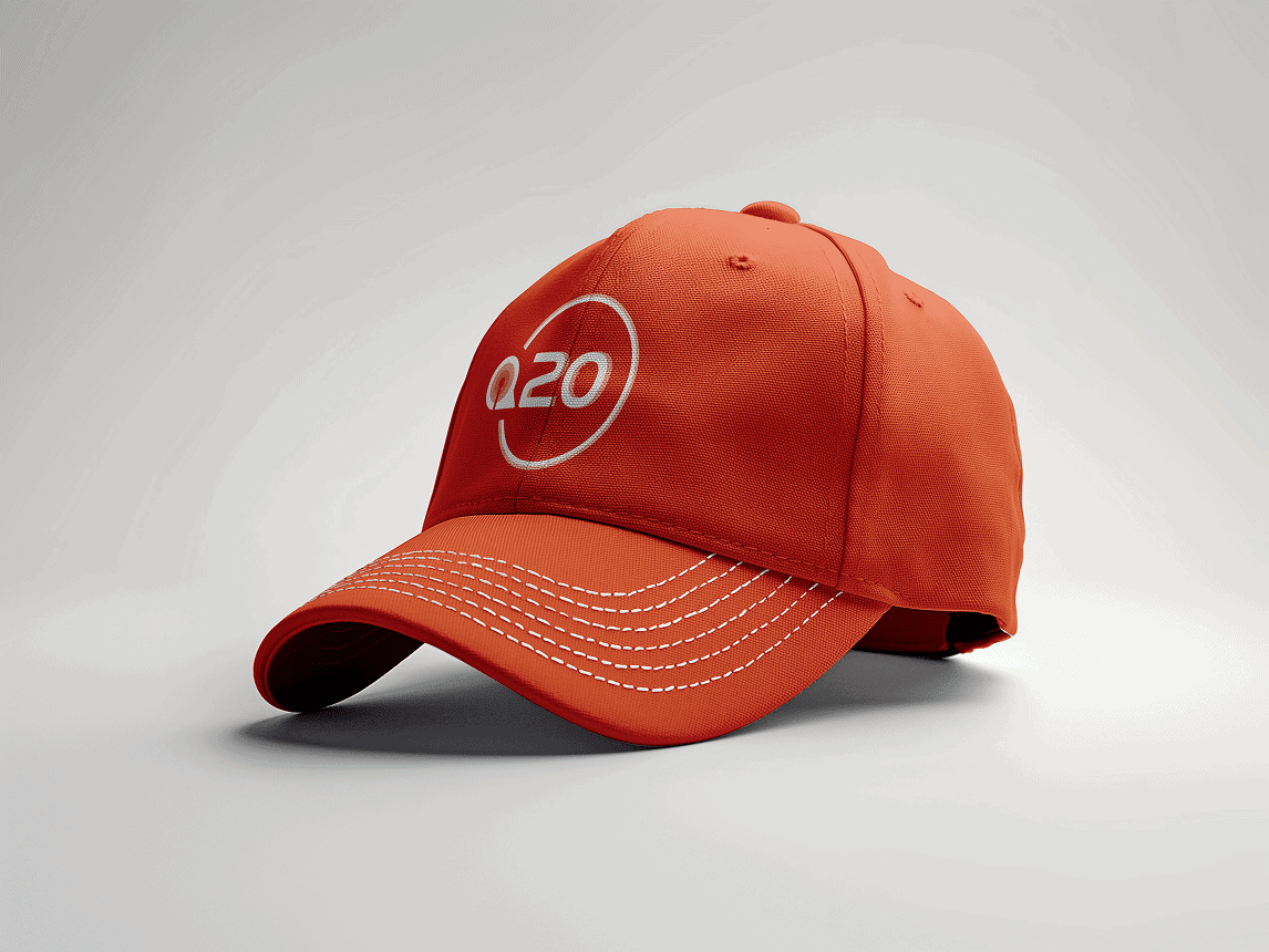
For the 20-year anniversary mark, I extended the new logo system with a celebratory ring motif that echoes the brand’s signal icon. The added “20” integrates seamlessly into the logotype without feeling like an afterthought, giving Biptel a flexible anniversary identity that feels festive but still unmistakably on-brand.
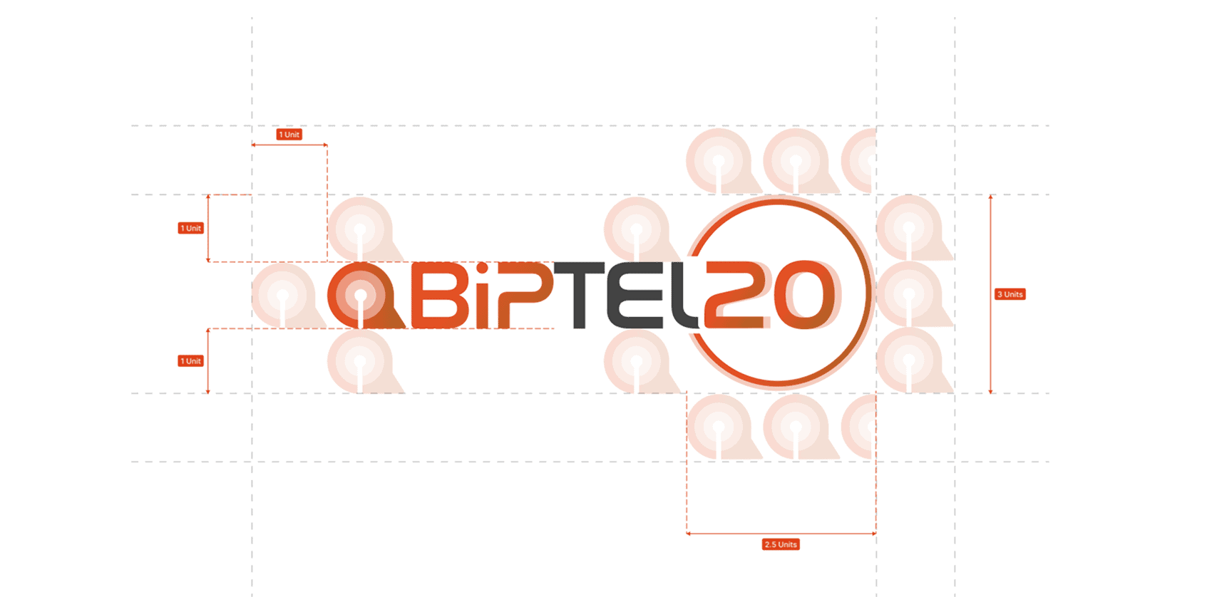
Logo Construction & Geometry
The anniversary logo was built on a consistent unit-based grid system to keep every curve, radius, and spacing perfectly aligned. By using the core icon shape as the foundation, the “20” integrates naturally into the logomark instead of feeling bolted on. This construction grid shows how the entire logo family maintains proportional harmony, visual balance, and a shared design language across all brand applications.
Web Design
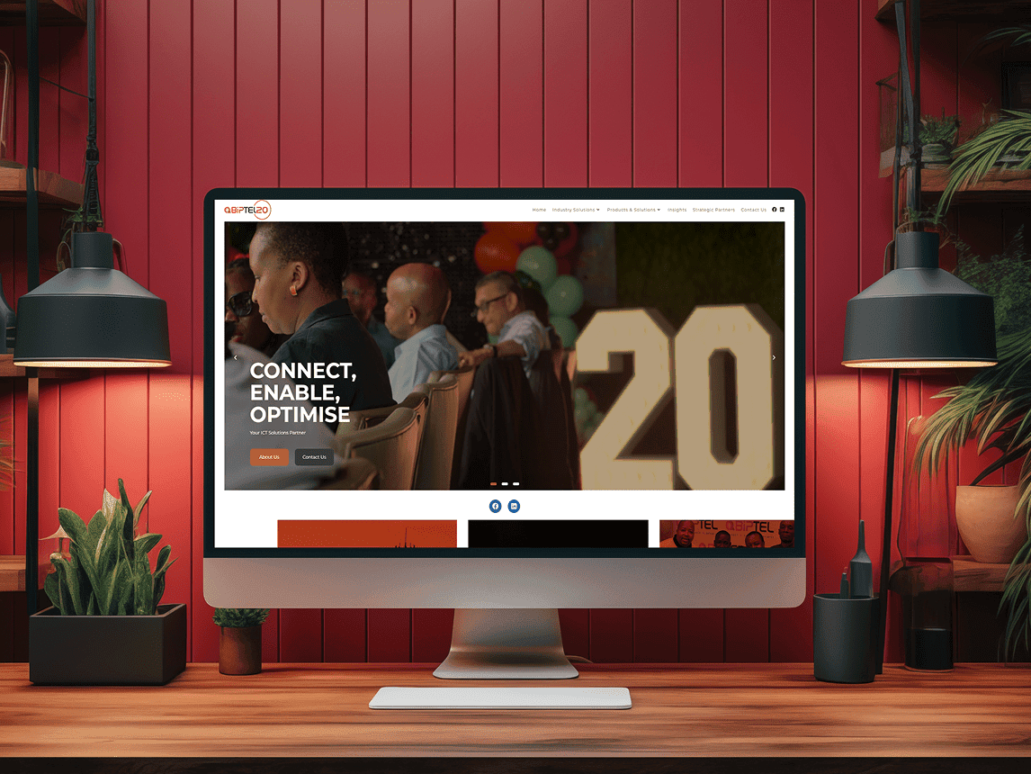
Website Redesign & Digital Direction
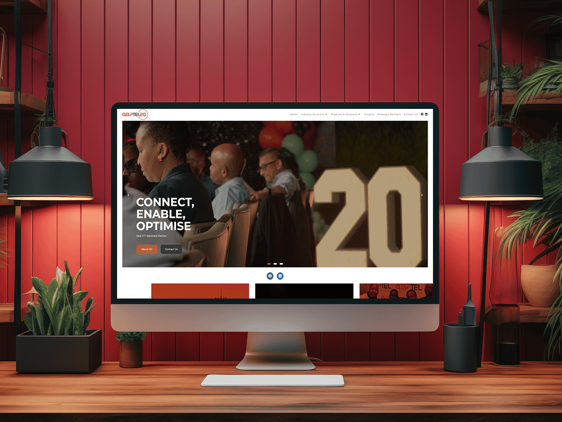
The new website for Biptel is built around a visual contrast that reinforces both brand identity and usability: the logo features soft, rounded curves that evoke connectivity, signal waves and human-centric tech, while the rest of the interface leans into sharp-edged, angular shapes to anchor the brand in a professional, high-performance space.
The top-level navigation and hero elements use clear straight lines and defined edges which frame the imagery and copy with structure and precision. Meanwhile, the rounded forms of the logo and subtle circular accents give warmth and approachable personality.
Together this duality feels intentional — friendly yet capable, human yet efficient — making the website feel trustworthy for corporate clients while staying visually distinct. The typography and spacing reinforce this by keeping the layout crisp and open, letting the contrasting shapes breathe and speak.
Conclusion
Redesigning Biptel’s brand wasn’t just a visual clean-up — it was a full reset of how the company presented itself to clients, partners, and the industry. From refining their logo to rebuilding their website and sharpening every piece of collateral, I created a system that finally matched the maturity of their business.
This project shows exactly how I work: fast, flexible, and fully invested in giving a brand a visual identity that actually works in the real world. It’s the kind of end-to-end partnership I enjoy most — taking something dated, untangling the chaos, and turning it into something that feels intentional, modern, and ready for growth.