created the full Webvite identity from the ground up — the brand, the logo system, the website, the visual language, and all supporting print and digital collateral. The goal was to position Webvite as a modern, trustworthy product-design partner for founders and developers. Everything in this project was crafted to feel clean, confident, and unmistakably Webvite.
The Webvite mark is built around a strong, minimal “W” enclosed in a geometric frame. The goal was clarity and instant recognisability — something that could scale from social icons to print without losing integrity. Its proportions and negative space were engineered to feel modern, structured, and unmistakably product-design–focused.
Full Logo
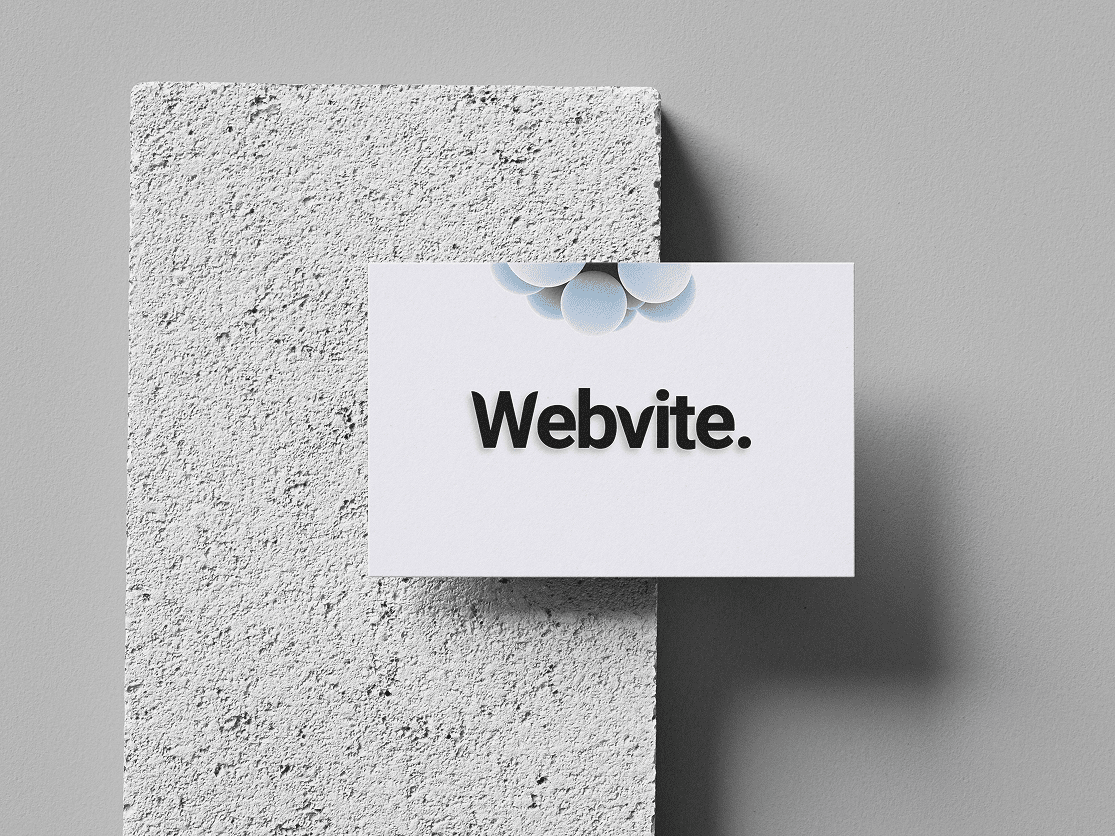
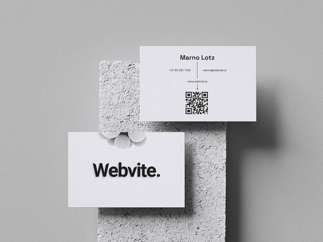
The full Webvite logotype keeps the brand’s personality simple and confident. Clean geometry, well-balanced stroke weights, and a sharp contrast between soft curves and angular forms give the logo a professional, systemised feel. It reads clearly in any context — from the website header to Figma mockups to business proposals.
Colour Palete
The Webvite palette uses a calm neutral base with a bold blue accent that communicates clarity, trust and usability.
Primary: #EBEAF5 — a soft, light neutral that keeps layouts clean
Secondary: #111111 — strong, confident, ideal for typography
Accent: #3A86FF — a modern, energetic tech-blue used sparingly for emphasis
The palette is intentionally minimal to let layouts breathe and keep the product-design aesthetic consistent.
Typography
The Webvite type system pairs Space Grotesk for headlines with Inter for body content. Space Grotesk brings character and presence, while Inter keeps long-form text highly readable and clean. Together, they create a hierarchy that feels modern, technical, and suited to digital product design.
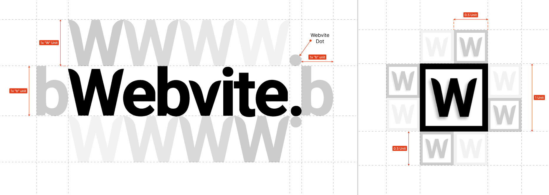
Logo Construction & Geometry
The entire system is built on a unit-based grid to maintain proportional harmony. Every curve, gap, and radius is derived from consistent spacing logic — ensuring that the “W” mark, logotype, and the signature Webvite dot feel like parts of the same modular family.
This approach makes the brand scalable and production-ready for any medium: screen, print, or 3D.
Web Design
Website Direction
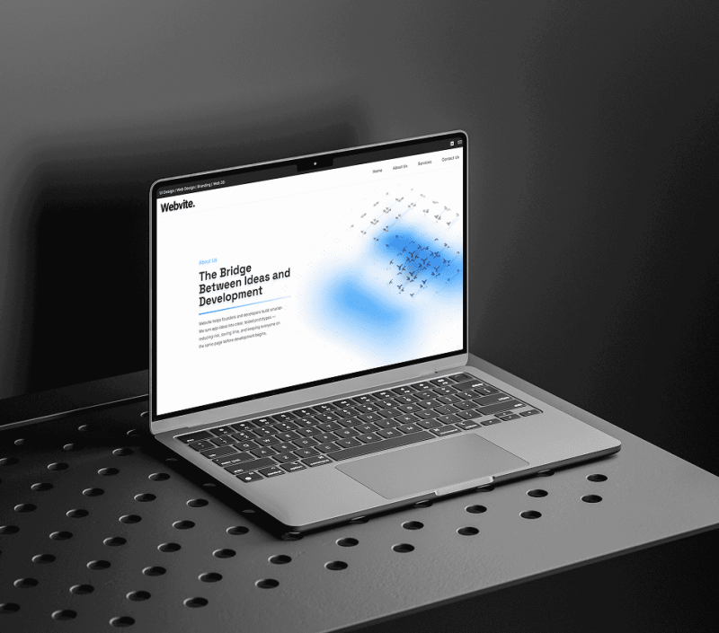
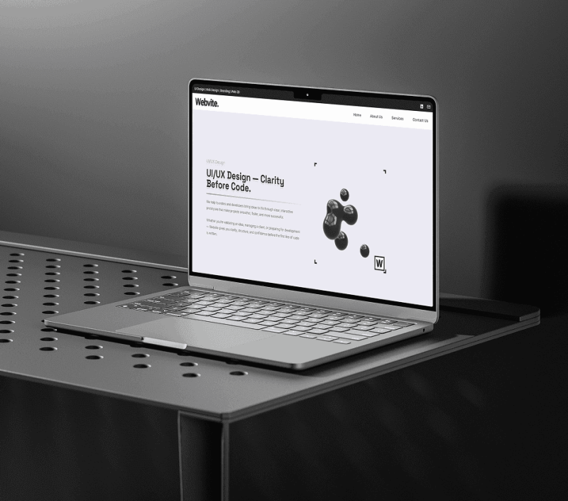
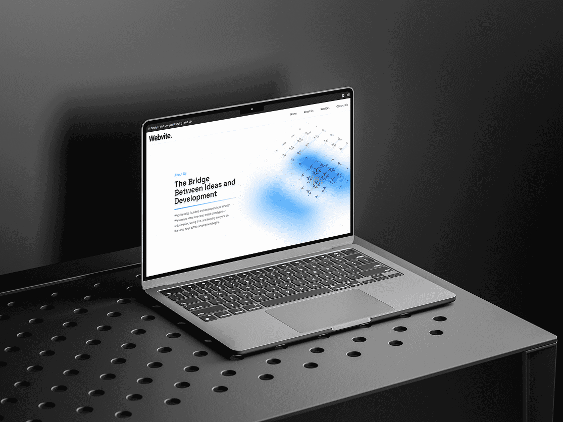
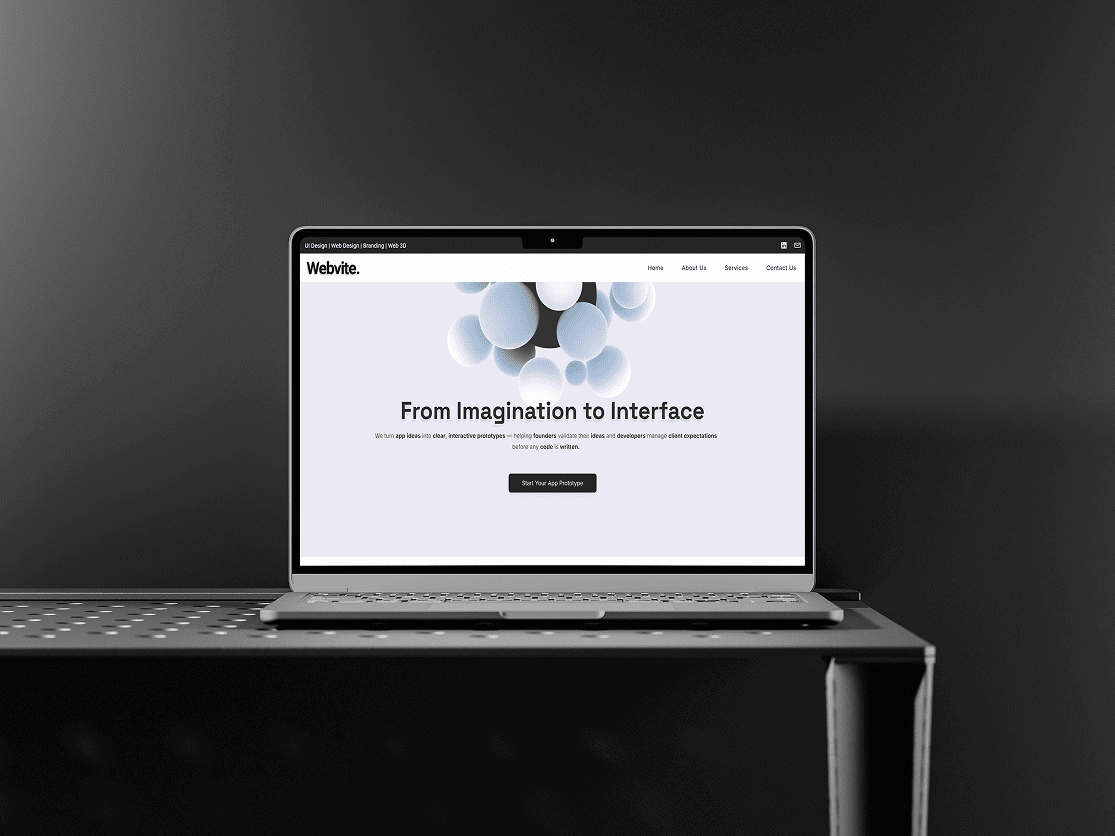
The Webvite website was designed to communicate clarity first — fast load times, clean layouts, and structured content that founders and developers can scan instantly.
I used Spline 3D for hero interactions, giving the site a modern and slightly futuristic edge without overwhelming usability. The UI combines:
sharp edges and precise sections for a professional feel
rounded interactive elements for approachability
strong spacing rhythm to make the pages feel breathable and uncluttered
This balance helps Webvite appear trustworthy, capable, and modern — the exact qualities founders look for when validating early-stage ideas.
Social Media & Templates
Static Social Media Figma Templates
I built a set of reusable, on-brand templates for Instagram, Facebook, and LinkedIn. They follow the Webvite visual system closely — crisp spacing, clean type, and minimal forms — making it easy to create consistent posts that feel premium and professional.
Templates include:
announcement cards
carousel covers
promo visuals
value-statement cards
branded photography layouts
All templates are optimised for quick editing and consistent output across teams and channels.
Conclusion
The Webvite project brought together everything I love about product-driven design: clean branding, smart structure, and a system that scales across platforms. By building the identity, website, marketing materials, and templates from scratch, I created a brand that looks modern, feels trustworthy, and communicates exactly what Webvite delivers — clarity, structure, and high-quality digital design for founders and developers.
If a recruiter or stakeholder wants to see what I can do end-to-end, this project is the perfect example.
The original Biptel logo had charm, but it struggled with balance, readability, and modern scalability. The icon and type felt disconnected, the proportions were uneven, and the visual style didn’t translate well across digital or print. Still, it had a clear identity foundation — especially the signal motif — which I used as the core inspiration for the redesign.
Full Logo
The new logo keeps the essence of the original — the signal icon and warm colour story — but refines everything with cleaner geometry, clearer hierarchy, and better weight distribution. I re-engineered the mark to feel modern, scalable, and professional while still instantly recognizable as “Biptel.” It’s the same brand DNA, just finally levelled up.